Our April meeting was a great way to wrap up before summer break. We were happy to have accomplished calligrapher and long-time Colleagues member, Diane von Arx, give a hands-on presentation on the critically important and often-neglected subject of spacing and layout.
I have felt for a long time that my calligraphic foundation (and work) had a big hole in it. Many of the calligraphy books I have seen do not include helpful information about spacing and layout principles, let alone any tips or tricks. Usually, books just mention the idea of using an “o” as an indicator for spacing between words, or a brief explanation of optical vs. mechanical spacing. The knowledge Diane shared with us was invaluable for our development as calligraphers. The answer I was searching for, of how much space is needed within and between words and lines, generally turns out to be “just enough.”
Diane covered several important principles during her presentation. If we simply use the size of an “o” for spacing between words, she explained, the result can tend to be little white rivers of blank space flowing through the text, which are visually displeasing. She illustrated the value of using ligatures to visually unify text when we need to save space within a line. Diane talked about how blocks of text “needed room to breathe” and how visually pleasant it is to have ample border space. She taught us that we need “just enough” space. Diane also showed us how to think about the elements of a piece, instead of just words on a page.
For our exercise, we were all given several sheets or paper with different blocks of calligraphic text on them in a variety of styles. We were instructed to cut them up and re-arrange them in our own way. She showed us how to use layout paper placed over the pieces to help with our final layout design. We marked where a block of text was on the layout paper and could then slide the paper around to determine the optimal placement. When we had all of our elements arranged how we liked them, we glued them down on an additional page to complete the exercise. It was an excellent process to learn how to arrange the elements of a piece before even picking up a pen.
It was very cool to walk around the room at the end and see the wide variety of layouts that people had created. We all had the same starting point but we all went somewhere different. I would have gladly spent a few more hours playing around with this. In the future, I know this method will save me tons of paper and countless hours of rewriting. I am very grateful to Diane von Arx for sharing her knowledge with us. We are lucky to have such a talented calligrapher and excellent teacher for what I like to call, with all due respect, a "guildy."
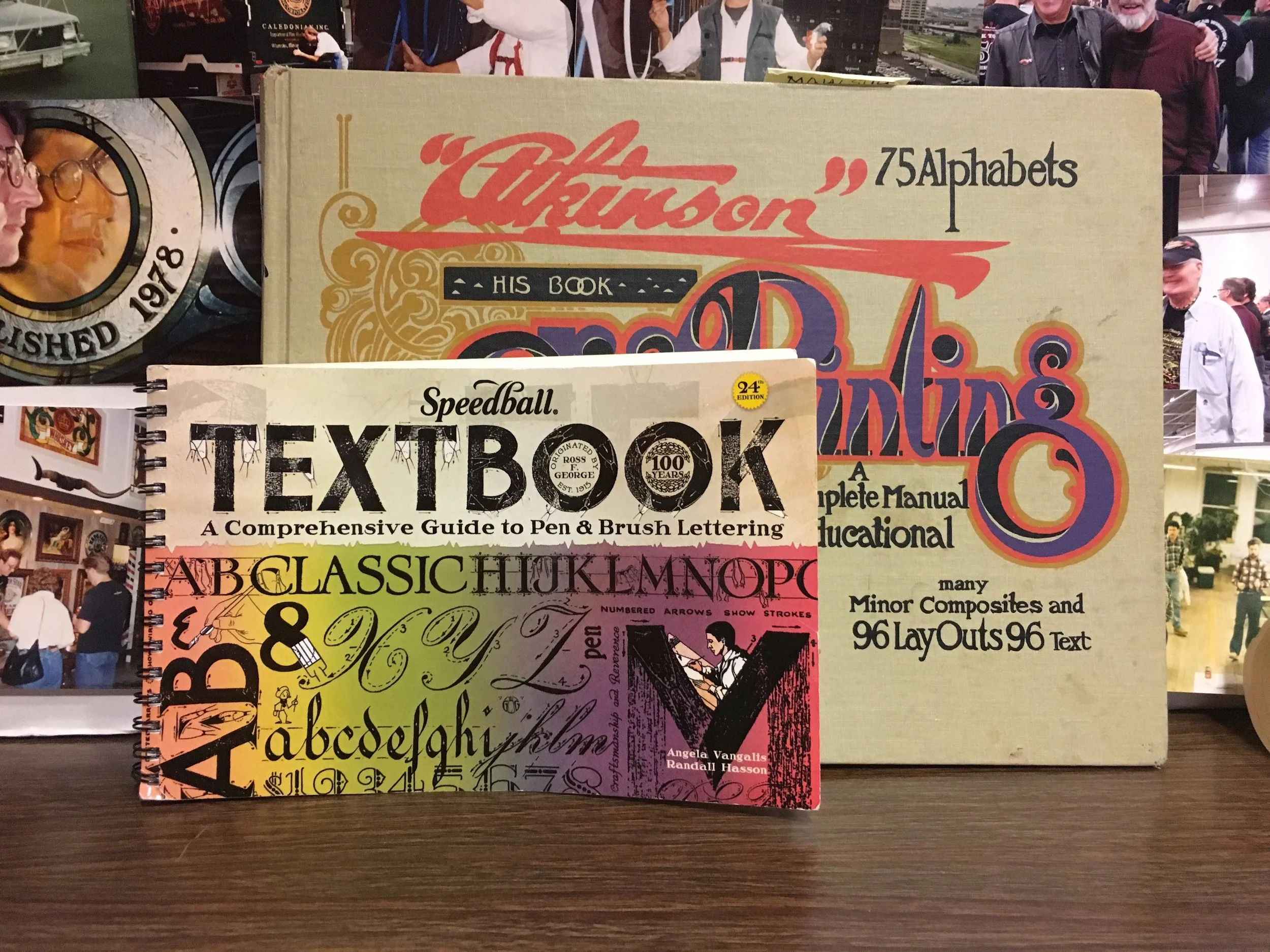
I would also like to thank long-time sign painter, “Bazooka Joe” Balabuszko, a newer member who volunteered at our Demo corner. He demonstrated some very interesting sign painting techniques and tricks before the program. He covered some amazing material, including making pounces, using a pallet and mahl stick, and doing gold leaf work.
Check out the videos and photos from the evening below. Watch for Marion Greene's review of the subsequent two day workshop we had with Diane.
We appreciate all the good things we learned and look forward to what's coming up next Fall. See you then, and until then, watch our website for new content over the summer.


