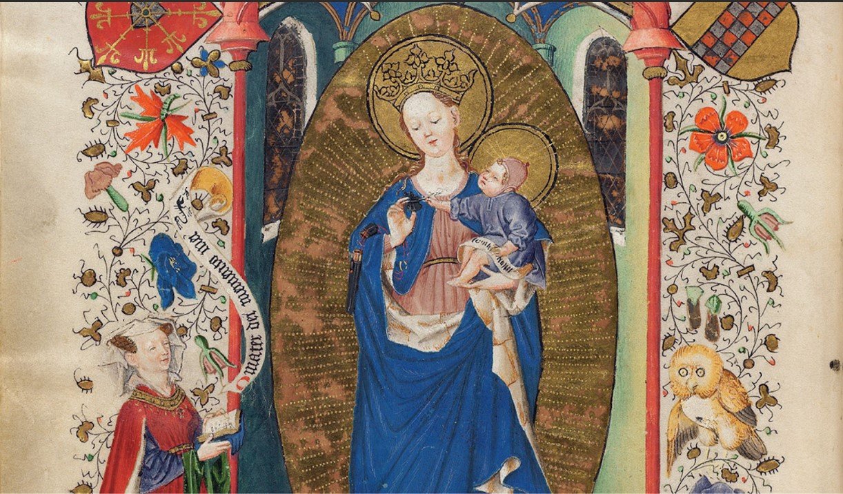
Della Hutchison honored us with an fascinating dive into The Hours of Catherine of Cleves manuscript.
Thank you to member Jean Formo for her lovely summation and review!
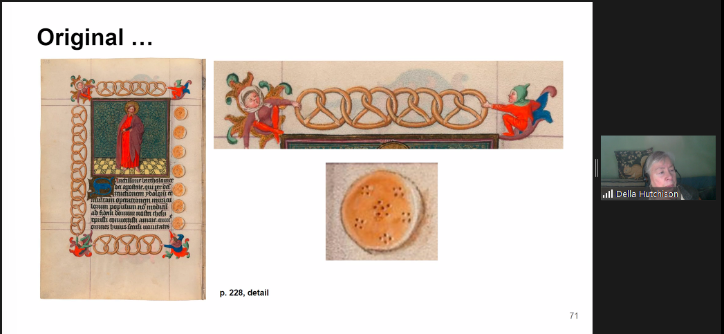
Cats and pretzels, beehives and butterflies, angels and demons, monkeys and gold – The Hours of Catherine of Cleves has it ALL, thanks to the level of mastery and imagination held by its creators. The Hours of Catherine of Cleves is known also by its nickname, “Pretty Kitty” named in honor of one of the illumination pages which shows a pet cat sitting on a patterned floor.
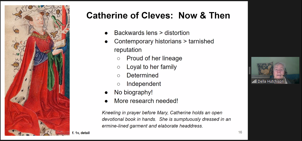
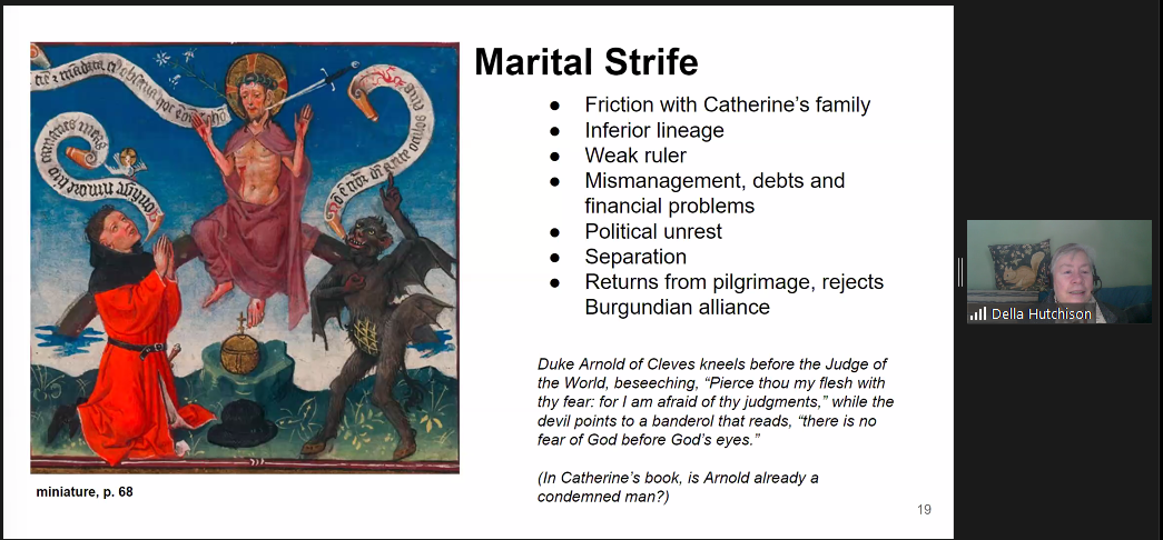
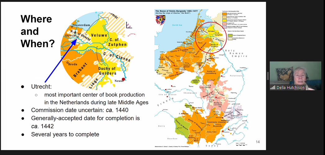
It is always a thrill to study a medieval manuscript, especially through the eyes of a passionate teacher/learner/calligrapher. In this case our guide was Della Hutchison who became smitten with this single book. It was commissioned in the mid 1400’s for Catherine of Cleves. Catherine, already wealthy from birth went on to “make a good marriage” ensuring financial and political advantages. By the time she used her Book of Hours (a guide to personal prayer and daily devotion) she was a duchess and her husband, Arnold was a duke. Her fine book of hours was produced in a distinguished illumination workshop in Utrecht headed by the still anonymous “Master of Catherine of Cleves”. We know that he was widely commissioned and his work can be easily spotted in at least 15 other existing manuscript books. The book was used daily by Catherine for around 31 years. She was to have no idea about its later journey after passing from her hands after her death in 1476.
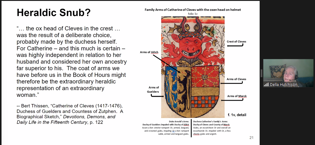
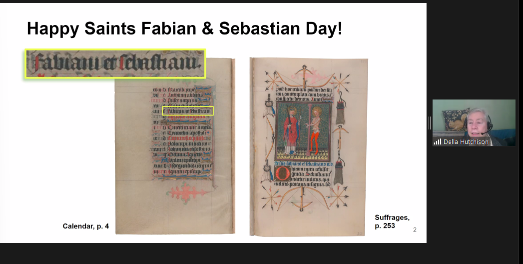
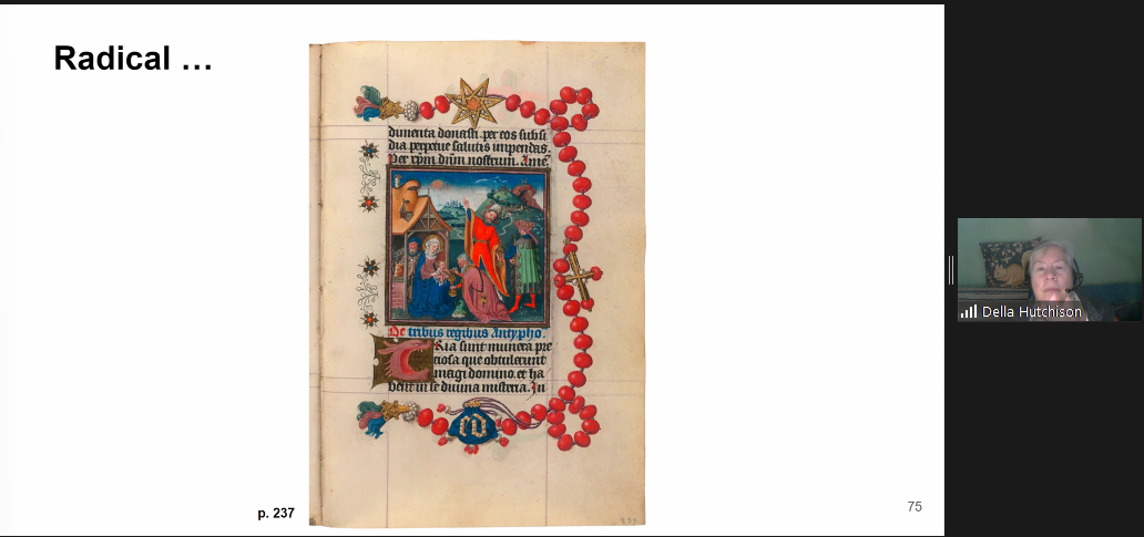
One way to dip into the history of writing is with a close study of a manuscript book. The Hours of Catherine of Cleves is a model reference for that purpose. Most existing medieval manuscript books have some story to tell, sometimes involving strange turns of events. This amazing jewel of a book is no exception. It was the subject of theft and major abuse as the centuries passed. Much later in the mid 1800’s it was cut into two separate parts residing with two different owners. During World War II, one part was confiscated by the Nazi regime. Soon after the war, it was discovered with other pieces of stolen art. In 1963, the Pierpont Morgan Library (now, the Morgan Library & Museum) bought the first part of the book, not knowing that it was simply a portion of the whole. While on exhibition at the library, a viewer mentioned that he had seen a very similar manuscript in another location. In time, the two parts were examined more closely. It was established that they indeed were two parts of a whole manuscript. Rebound now as three volumes, the original book lives at the Morgan Library & Museum in New York City, on view there for public study.
Later in the 1960’s George Braziller, who had attended the Morgan exhibition, published his well-known facsimile book of The Hours of Catherine of Cleves.
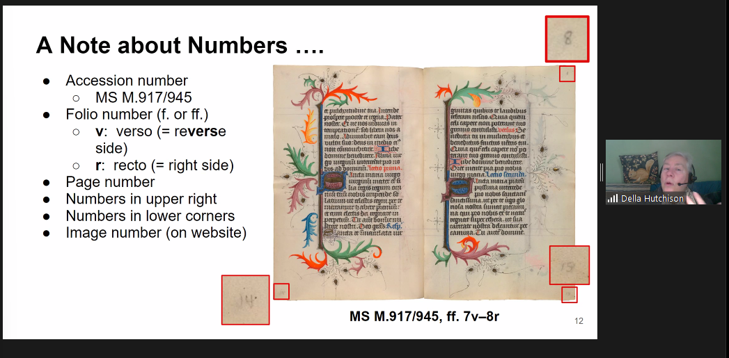
Della reviewed the typical contents of books of hours, noting that each had standard sections for prayer and devotion, including Bible readings, calendar pages and litanies. She pointed out other details common to the Cleves Hours and others, noting abbreviation signs, punctuation marks, combined letters and the purpose of various numbers on some pages.
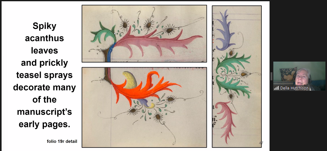
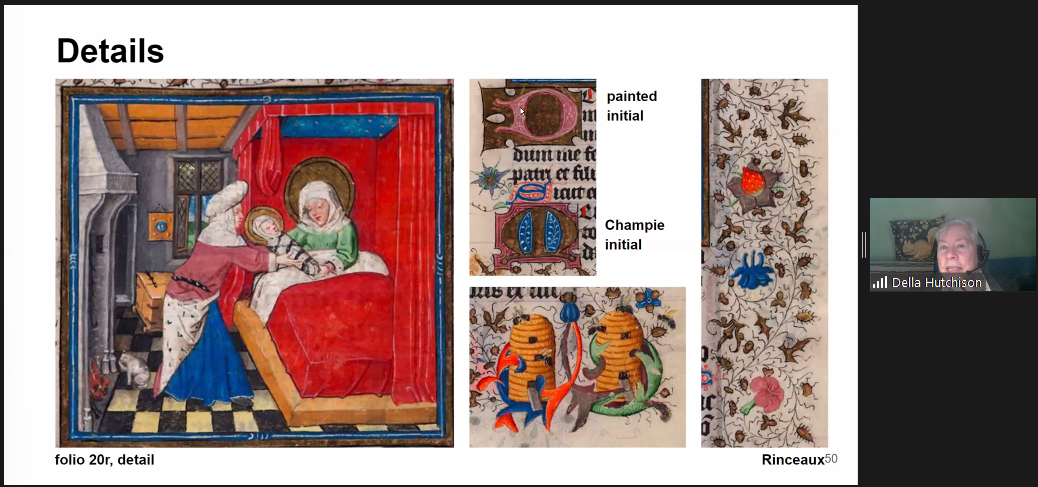
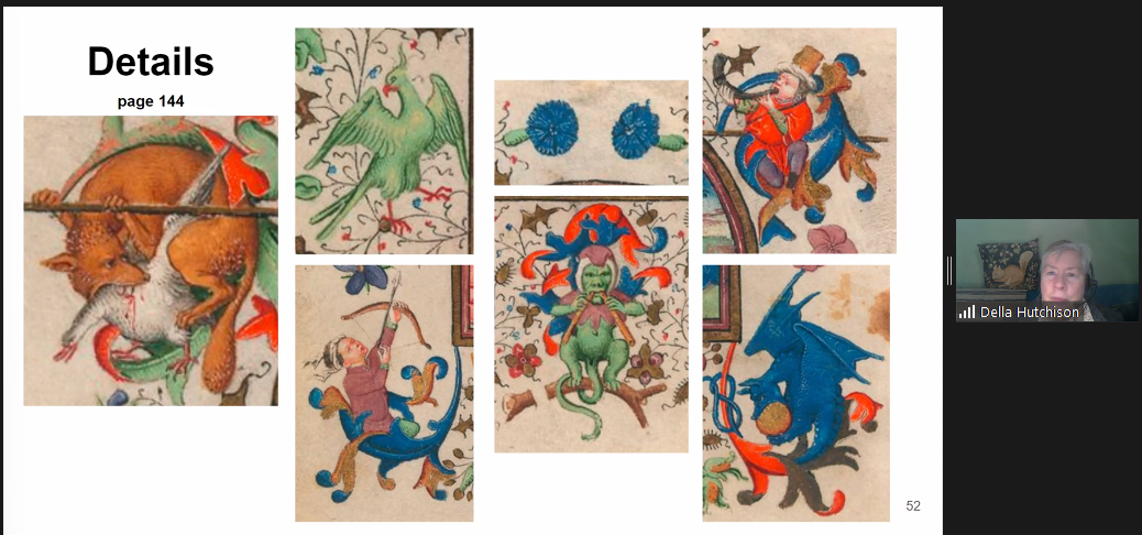
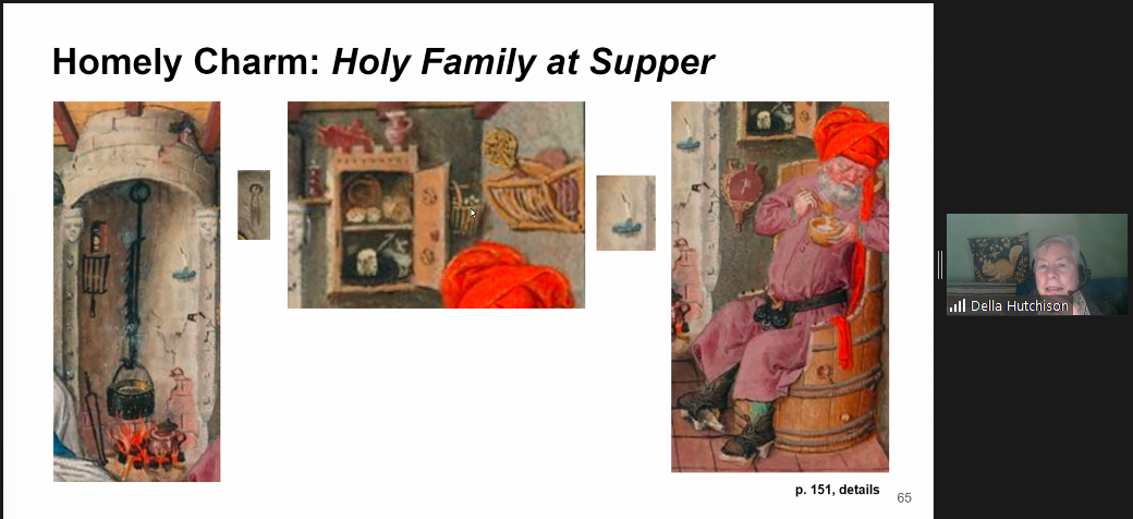
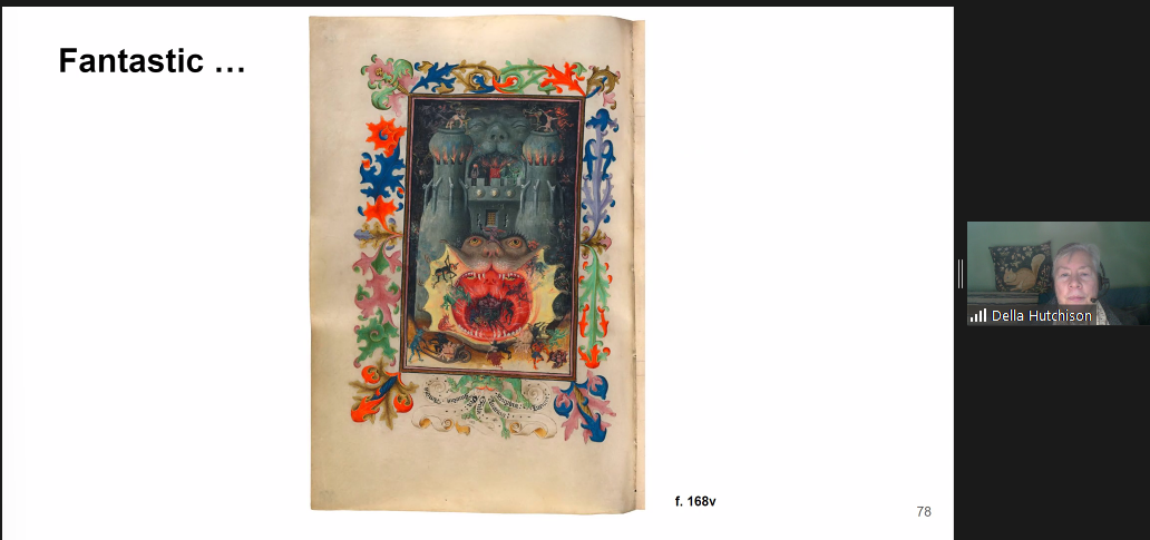
The visual voice of this manuscript varies. The mood ranges from almost contemplative with a little added flourishing around the text block to heavily illuminated pages including a terrifying image of the “Mouth of Hell”, complete with a fiery-eyed monster soon to devour a group of regretful sinners. Other pages are like trumpet fanfares, bursting with images, colors and gold.
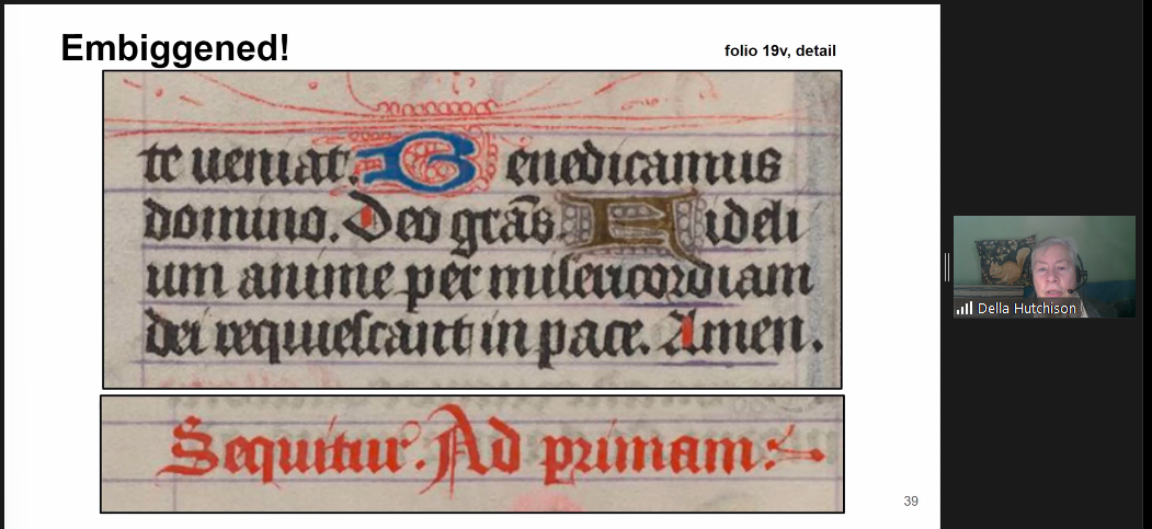
The scribe for Catherine’s book is not known by name, unfortunately. His style of gothic blackletter is littera textualis formata, or quadrata. It has diamond shaped serifs and bifurcated or forked ascenders. He often used hairline flourishes and most often held his pen at 40 degrees to the line of writing. It is to be noted that as with many scribes of the time, his letters floated between the waistline and baseline, rather than sitting directly on the baseline. The writing is exceptionally small – about 1/8” height for a minuscule letter h – not easy to do!
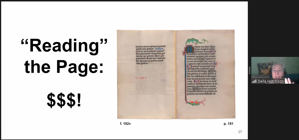
In keeping with the prestigious Utrecht workshop, led by The Master of Catherine of Cleves, this book of hours is exceptional on multiple levels. Its calf-skin vellum is mostly without blemish or scarring. It is sometimes very thin and almost transparent. The hair and flesh sides of each page are almost imperceptible. That is usually characteristic of a very young animal. The vellum preparation of stretching, scraping, and sanding is very expertly done.
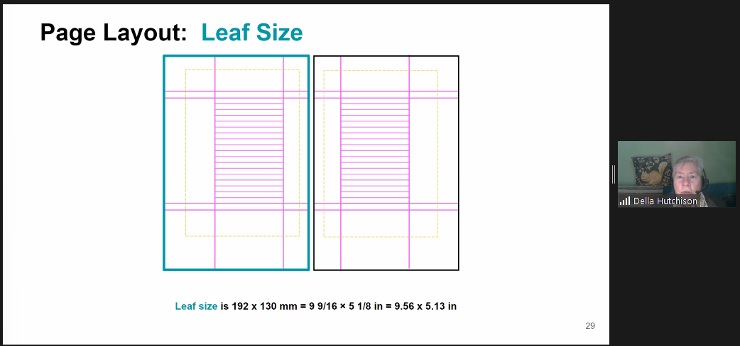
The margin proportions are in the classical style for medieval book design, as later taught to 20th century calligraphy students in England by Edward Johnston. Although the text block is vertical, narrow and small, the page size itself is larger than most books of hours. It measures in at 9.56 by 5.3 inches. The ruled vertical area, reserved for the scribe’s text is narrower than an American dollar bill.
When calligraphers study something in depth, we need “our stuff”. Della kindly provided accessible online “stuff” for us to continue the journey. Her detailed letter analysis pages with close ups of the text are an open invitation for further adventures on our own!
Jean Formo Feb. 1, 2024
